Be Healthy is a mobile application prototype intended to help users change their eating habits for better health.
Be Healthy uses alarms to remind users to eat 5 times a day. Be Healthy suggest easy to prepare recipes based on users’ favorite foods helping them to control their weight and daily calories’ income over time.
This article illustrates the process of prototyping a Behavior Change Application and how users’ behavior led design decisions over the process, starting by addressing user needs to a final interactive prototype, ready to start coding and design process in next step.
Prototype design is all about taking decisions based on user’s needs, interaction and behavior.
From a conceptual angle, Be Healthy is intended to help those struggling with their weight. From scratch, the goal was to help users eat every three hours.
By encouraging users to include a breakfast, a mid-morning snack, lunch, mid-afternoon snack, and dinner based on their favorite foods, users can achieve their weight goal.
Planning
Creating a development plan was revealed as crucial to take advantage of time and resources.
Be Healthy development plan was created as a living document. During the first steps, the plan just summarized each stage goals, but, once basic decisions were taken, specific tasks were detailed to accurate measuring time and resources needs.
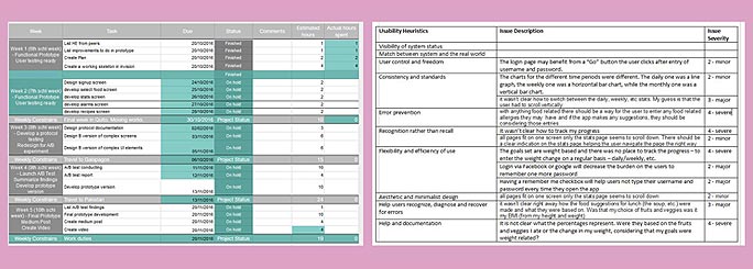
Development plan and Heuristic evaluation: Living documents
This informal way of planning helped to take calendar-based decisions, like limiting features in this first version of the app or devoting less time to some tasks rather than others.
Analysis and research: From Need finding to creation
The design process started by analyzing user needs and researching other applications for changing eating habits. A group of users were observed and interviewed while using weight loss, calorie counters, and diet journals applications.
User observation
Users observation was focused on the study of user’s behavior while using these applications in different locations and environments. The users group included different profiles, from new to experienced users.
Users’ behavior shown interesting gaps and opportunities: Soon it was revealed that these applications have too many features and infinite options. Configuring so many parameters took long time. Struggling with so many parameters discouraged some users in the experiment. Some users had a strong resistance to use their applications in the way they were supposed to.
These sessions were recorded and several stills were extracted from these videos to illustrate design breakdowns and workarounds taken in these sessions.
With these findings, a list of potential challenges and interesting design opportunities was created and some features like how to help users to eat slowly, or how to help them to maintain a balanced exercise routine were discarded.
Creation
A brainstorming session helped at this stage to highlight potential starting points for a conceptual frame: What users really need?
Ten existing health applications were studied and a key aspect was revealed: Simplicity and limited options were basic to achieve application goals.
Creation process resisted the willing of seeking for specific solutions and it was focused on what problems and opportunities would address user needs.
As a result of this brainstorming session, some concepts were written down and a clear objective was defined: The primal objective was to keep the application simple and limit its features. Encouraging users to perceive their weight goals should be a fundamental aspect.
Design: translating ideas into images
Clearly, analysis and research phase in prototyping design is critical. A basic point of view to start designing must be defined based on the findings from this process.
Creating storyboards helped understand user’s profile. At first, Be Healthy was focused on two different user’s profiles: those struggling with lack of time to eat in a healthy way, and those lacking of knowledge to prepare healthy meals.

Users’ journey and Paper prototypes
Storyboards shown users’ journey through their needs and the potential use of the application, illustrating who the user was and the app’s usage most common situations.
This exercise helped to define the user profile: those who struggle with time but are aware on how eating five times a day can help them loss weight.
Paper prototypes
The best way to start putting all these concepts into images is to draw simple paper prototypes.
Paper prototyping was highly valuable to define design approaches which address the goals of Be Healthy App. On the other hand this was a fast way to discard some ideas to approach problems and focus on those performing better.
Paper prototypes shown the essential elements that the application interface should contain to address already defined user’s profile, those that face user needs focusing in the core concepts of the application.
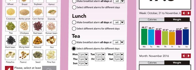
At this stage, the most complex screens were exposed: those which will be used to con-figure user’s favorite foods, select desired weight goals, and establish meal time alarms.
Heuristic evaluation
Once this paper prototypes were designed, these were tested conducting an in-person Evaluation, letting users interact with this sketched interface.
Recording testing sessions was a good start to assess evaluator’s body language and gestures. Reviewing these videos helped to identify many potential problems not saw in previous phases.
Be Healthy was designed minimizing the use of back buttons but these heuristic evaluation tests shown that, even at this stage were paper prototypes were used, some screen will definitely need a back button.
Even if evaluators were focused in the basics, as the paper prototype was a very primal version of what the prototype would be, notes taken from these versions were highly valuable and provided precious information about which and how these heuristics were violated.
Heuristic evaluation proved that menu options could be better organized and suggested potential improvements to address major usability problems found in those screens ad-dressing foods selection.
All these issues were listed and major problems were prioritized to brainstorm potential solutions.
Putting all together: interactive wireframe
These solutions were reflected in a low-fidelity wireframe.
The wireframe design was focused on those screens being the core of the application, addressing those key features needed to understand how the application will work and leaving away those screens not relevant to understand the specific point of the application.
This first wireframe contained the home screen and a full set of navigational links. The goal was to get a navigational skeleton up there that someone can click around and get a feel of the application’s flow.
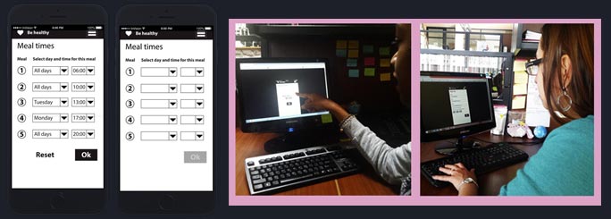
Interactive wireframe and testing session
To test a prototype functionality there’s no need to have it completely polished. As far as the overall look and feel reflects the final prototype and navigation links are functional is enough to test it with selected users.
Sometime was devoted to choose the prototype design tool that best fitted the case. Axure, and Balsamiq, despite being great prototyping applications, were discarded and Invision was selected due to its simplicity and flexibility, for Be Healthy App, uploading screens straight from Illustrator, add hotspots to transform static screens into clickable prototypes, and work on both mobile devices and simulated mobile devices were critical features and, Invision, did the job so fine.
Test-refine-test
Once this first wireframe was ready for evaluation, a testing protocol was created.
User testing may seem similar to heuristic evaluations, but there are some important distinctions that make them different. With heuristic evaluation, what evaluating participants say is paramount. With online experiments and user tests, what participants do is para-mount.
Some questions asking users to perform specific tasks were evaluated before testing to ensure instructions were clear and all users will understand what the task was.
Be healthy testing protocol covered test preparation and setup, consent forms for testers, instructions to participants, and how these will be evaluated.
Representative testers were selected from a target group expected to use the application, people struggling with no time to eat properly.
As in previous testing, sessions were recorded to study body language and some reactions users did while conducting the test.
The prototype was feed with user comments and some design decisions over buttons’ hierarchy and the way to display statistics’ screens were taken during the test.
At this stage, using Invision was very useful, making possible to modify and update the prototype in a fast way before running the next participant.
After testing, results were compiled and all notes extracted from recording were translated into a list of changes. Those bugs both small and easy to fix, or too severe to ignore were redesigned.
Those screens used to set meal alarms performed differently from some users than others so, these screens were redesigned taking into account their inputs in two different ways.
An A/B test was conducted, showing the entire application to new testers but asking them to specifically focus on performing tasks in those screens.
Some testers were randomly assigned to the original version of the alarms screen, the ‘A version’, while others tested the alternative design, the ‘B version’. A new protocol was written to find a significant difference between those two designs.
Comparison between A and B testers’ conclusions leaded into a list of changes to make.
Finally, some hierarchy elements were polished to help designers and coders start the look and feel and programming processes.
Final stage
Prototyping is all about being user focused, from needs to behavior interacting. Be Healthy App was prototyped ensuring that all things related to user needs, goals, and behaviors were taken into consideration from the conceptual frame to an interactive sample. Using this methodology will guarantee consistency and human-focused design through all prototyping tasks.
What about you? Are you using the same process cycle? What phases of prototype design will you change or improve?